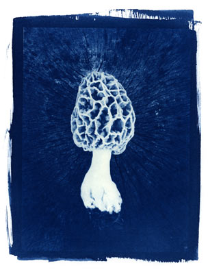
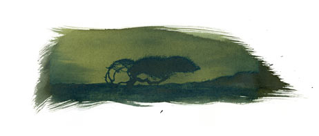
Cyanotype is a print made with iron, exposed in sunlight. Ferric iron through a chemical twitch of mixture and exposure to light becomes ferrous iron in the print, leaving the famous hue Prussian blue, which is fun to read in other languages; azul de Prusia, bleu de Prusse, Preußischblau. 
Cyanotype goes way back to the beginnings of photography. Sir John Herschel, that fountain of photographic invention, discovered the process in 1842 as he was experimenting with the light-sensitivity of just about everything. He considered it to have limited practical photographic use and used it as the first photocopier, making blueprints of his notes. His friend, the botanist Anna Atkins, responded; you use it to copy your notes, I’ll use it to copy my sweet seaweed collection; and in 1843 proceeded to produce the first book illustrated with photographs.
Iron is not quick like silver. Cyanotyping takes some time. The sensitizing chemicals are measured and mixed and then brushed on a substrate (like paper), and set in the sun with something to block the light (a negative, or an object). Each print takes about twenty minutes up here in the Wisconsin summer sun. Even with careful preparation and planning, something as simple as a single cloud passing over the sun during an exposure can change the print by a lot. A buckled negative, uneven coating, a bug resting on the nice hot glass and you get less contrast, more contrast, paler blues, deeper shadows, weird crazing, odd spots.
There’s an intense visual difference in the stages. It starts out very clean, pale, electric yellow and moves through stages of darkening and mottling green until it just looks like a disease, a powdery patina of unhealthy blueblacksilver shot through with chartreuse veins. Once it looks like this, it’s ready to come out of the sun. The unexposed yellow iron is removed in a water bath and the print on white watercolor paper slowly clears into sparkly clean white and a fat heavy blue.

I find it a challenge to choose a subject for cyanotype. You can print your snapshots and they’ll look exactly like photos, only blue. Going through images, I’m always trying to find something that’s going to make sense being that delicious blue-glass-bottle blue. Something graphic or cold, or clean, something viking that would work in salt water and iron and ice. Something very North or very South where blue and white come together as snow or sand with sky or sea.
Why work with this instead of something quicker, easier, more dependable and less cyan? On a practical side, the print can sit in the summer sun for the length of a game of horse and I am not locked away from my children in a darkroom making silver prints all the summer day. It is so slow you can do it during your life instead of instead of it. But it is also a way of speaking photography that is different from anything else. As with any material, it teaches you what it will do and what it will not do, what it will say and what it will not say. And as with any artistic process, it has its own particular shove and will leap up suddenly with spikes of meaning and tooth-edge truth that would never, ever have appeared if the print were not bright, brash blue.
